Australia Defined – A snapshot of population growth and change [INFOGRAPHIC]

Here’s a new infographic!
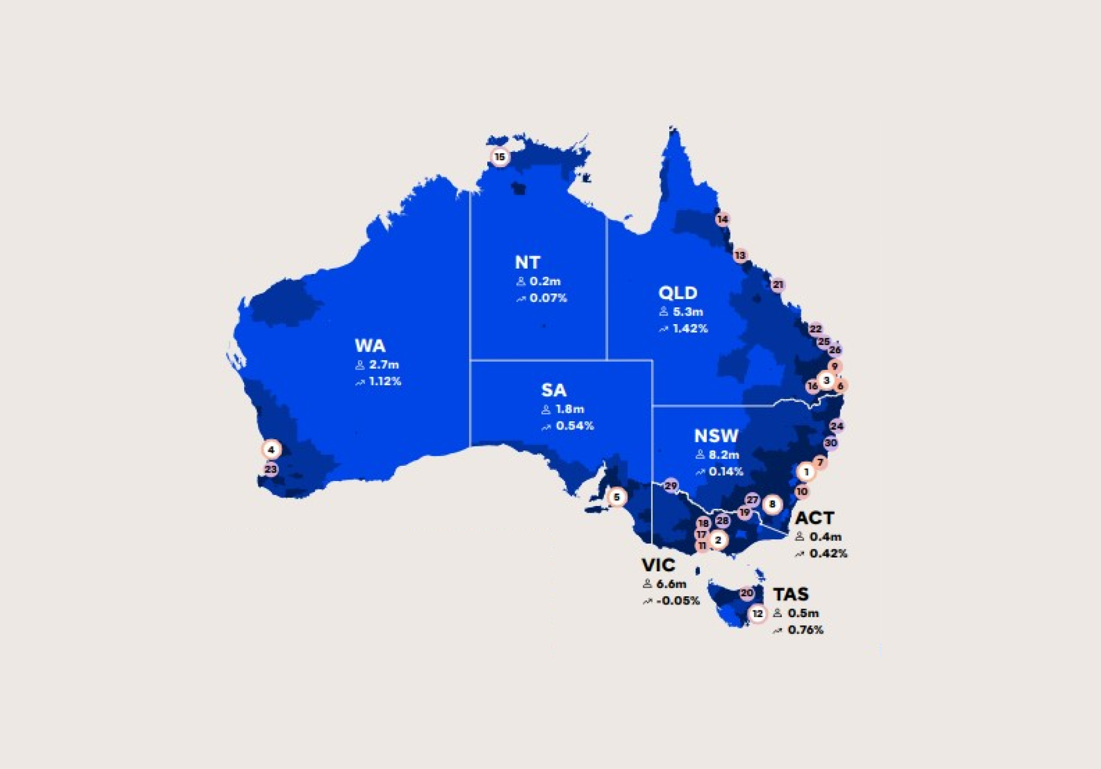
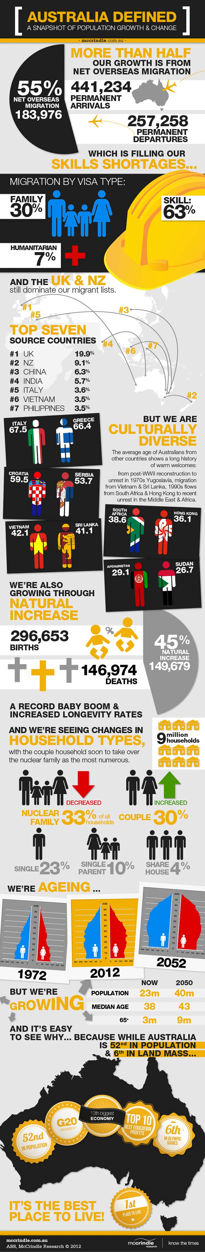
More than half of Australia’s growth can be attributed to net overseas migration, which is filling our skills shortages. The United Kingdom and New Zealand dominate our migrant lists, but we are culturally diverse.
We’re also growing through natural increase, with our nation going through a record baby boom and increased longevity rates. We’re seeing changes in household types, we have an ageing population, but we’re growing.
And it’s easy to see why… because while Australia comes 52nd in population and 6th in land mass, it’s the best place to live!! 🙂
Keep scrolling for the eye candy…
All our infographics can be found on our visual.ly account ![]()
For media commentary contact us on 02 8824 3422 or at [email protected]