Turning data into a story

In a world of contracting attention spans, increasing consumer expectations and an emerging generation who require information to be interesting, getting cut-through can be a challenge. Yet at the same time, we have access to more data than ever before, and it is becoming an increasingly important part of business strategy to utilise it. So, if you are tasked with communicating a dataset, we recommend turning it into a story to achieve maximum impact. Here are three tips to help you get started.
Find the problem or point of interest
As more platforms and messages compete for our attention, “Why is this important to me” is a question consumers consistently ask themselves. If you can identify and highlight early on the problem your data explains, or the reason why it is of interest to someone, you are more likely to get cut through with it.
Make it visual
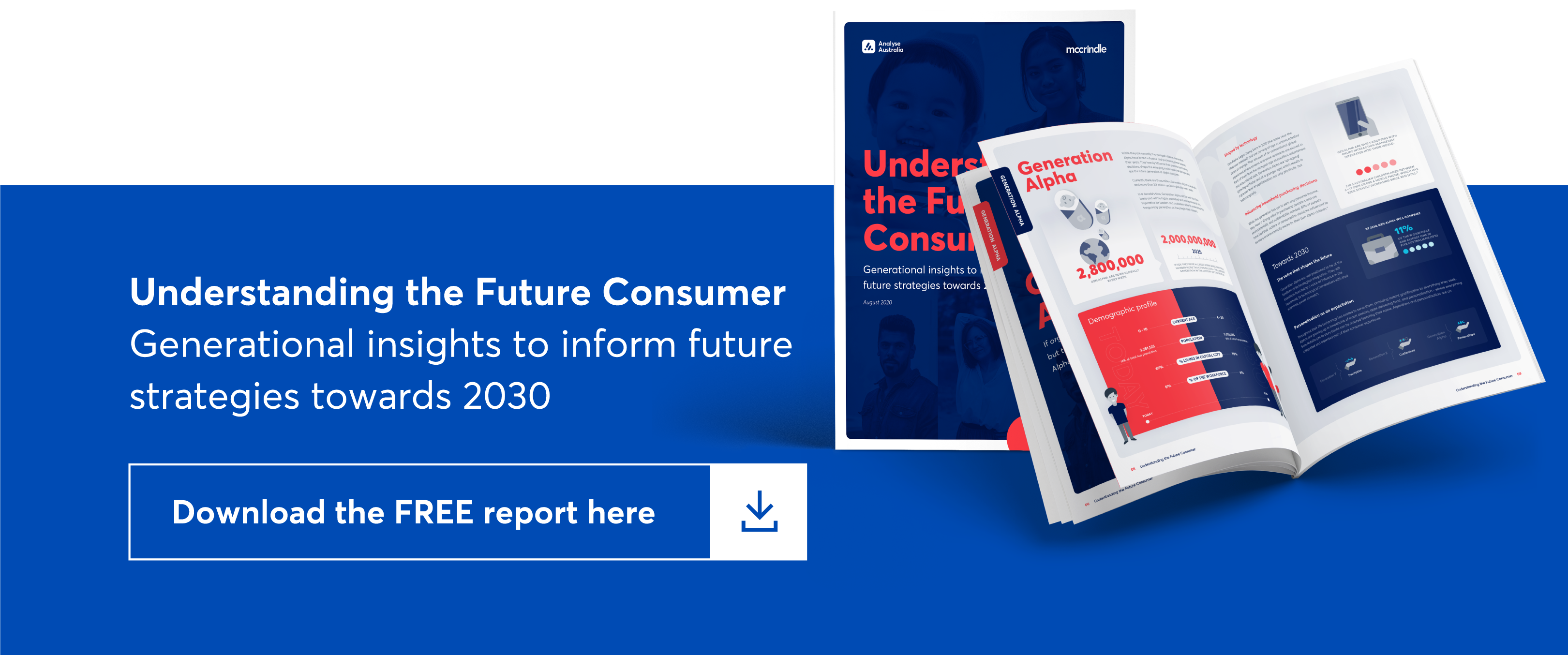
Data can be boring, but it can also be exciting, interesting and inspiring. How? When it is communicated visually. Use icons instead of graphs or tables and colours to show importance or emphasis in your data story.
Reduce and simplify
A key element of a story is that there is a narrative, or a sequence. There is a beginning or introduction, a problem, and then a solution. This structured approach helps when you are communicating data, whether it is in presentation, report or infographic format. Use headings in reports, reveals in presentations and sections in infographics to reduce and simplify your data story so that it is easy for people to understand and engage with.
We love helping organisations bring their data to life. Get in touch with us today if you have a story you’d like help in telling.