Infographic
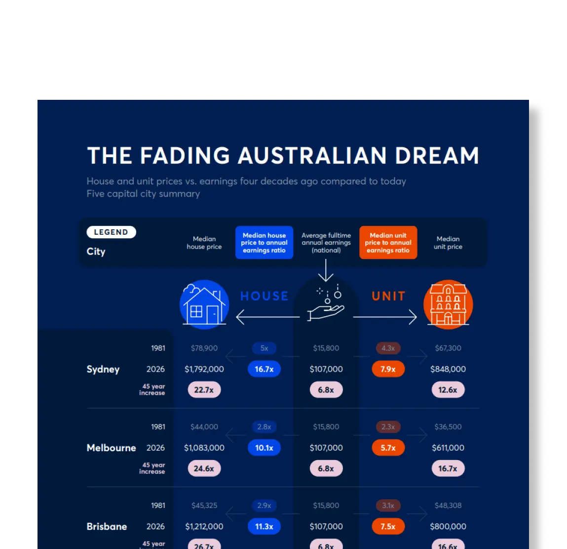
The fading Australian dream infographic

While national full-time annual earnings have increased over the last four decades, property prices have risen at a significantly faster rate. This infographic tracks median house and unit prices from 1981 to 2026.
Key insights:
-
In 1981, median house prices across major capitals ranged from 2.5 to 5 times average annual earnings, whereas by 2026 they escalated to between 10.1 and 16.7 times annual earnings.
-
National average full-time annual earnings increased 6.8 times over the 45-year period, while median house prices grew by more than 22 times.
-
Sydney remains the least affordable market, with the median house price rising 22.7 times to $1,792,000, 16.7 times the average annual full-time earnings.